BLACK AND WHITE
 |
| Original |
 |
| Edited |
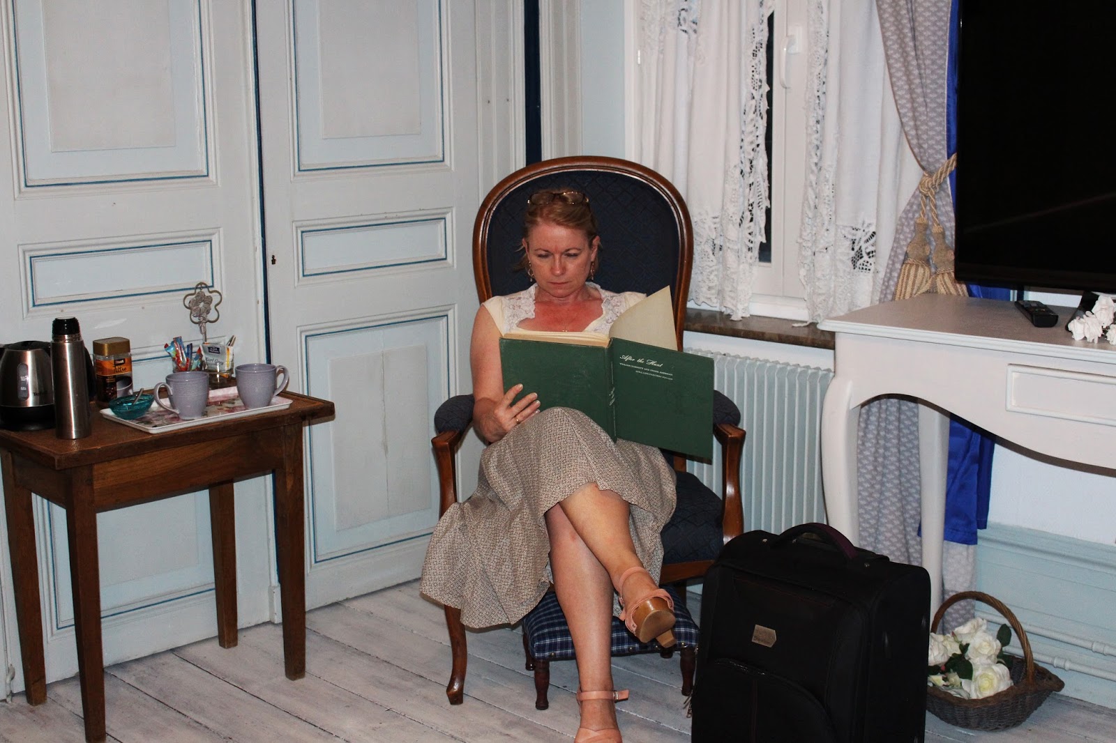
I created this black and white image by adding a black and white adjustment. It was very simple to create and I feel it is very effective in creating the dramatic atmosphere I was aiming for with this piece. To help create the right tones I also added a curves and a levels adjustments after the black and white filter. This image was created during my ninth shoot therefore it links closely to my project, People and Possessions.
DUOTONE
 |
| Original |
 |
| Edited |
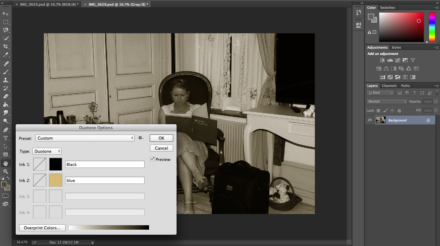
The screen grab to the left shows the colour which I chose for this duo tone. I chose these colours to produce an antique image with an dated atmosphere. To help create this atmosphere I also cropped the image to remove the television and electric kettle to keep the illusion that the image was taken within the past. I think this image links to my project and would link closely to my exam pieces as it could show how possessions have changed as this image shows a possessions in a old vintage setting. I created this duotone by the following steps.
- Select 'Image' then 'Mode' and chose 'Greyscale'. This is allow you to use the duo tone
- Select 'Image' then 'Mode' and chose 'Duotone'. The option similar to above with be shown. However only one colour can be chosen Select 'Type' and chose 'Duotone'. This will them show two colour options and adjust the individual colours as desired.
- To save the duotone as a jpeg one step must be carried out. Select 'Image' then 'Mode' and chose 'RGB Colour' This will then allow the file to be saved as a jpeg.
REPETITION


This image was taken to show how people live on the streets and do something they love to try and gain money to survival. This technique has helped me enhance the idea I tried to show within my shoots for this Unit. For this particular technique I did not adjust the original image I only changed its arrangement and duplicated the image. To start, I first adjusted the size of the image to 4cm by 4cm with a 300 inch/pixels resolution. I created a new document which was big enough to fit four of these images in. I then dragged the image onto the new document. Before dragging the image again onto the document I flipped the image horizontally and dragged it onto the new document. I then done this two more times flipping gut image as appropriate to create this mirrored and repeated effect.
SELECTIVE COLOUR
 I created this image by first adding a black and white filter to the image. I then selected the colour highlighters and whilst on the black and white layer I rubbed out the area I selected. This allowed the colour version of the image on the layer below to show through however only in the rubbed out area creating this effect. I like the look which this image has and how the pink and blue contrast the dramatic atmosphere created from the black and white filter. I like how this effect has helped to highlight two small possessions which the little girl has, demonstrating how we use some small possessions very often however over look there importance within our day to day life. The effect has helped me to portray a deeper meaning to the image and enhance an idea portrayed with my shoots of how small ideas can mean a lot to people and are valuable to them however maybe not to other. This interpretation comes from how they appear important to her however other would see them as simple and cheap belongings.
MULTIPLE IMAGERY
 I create this multiple imagery piece within my exam to show a selection of places of the gramophone. This technique is very simple to create however getting the images to align was tricky as I had to adjust the size of the image on the right a few times to make the multiple imagery work. I first adjusted the size of all the images before creating a new document which would fit them on with space around the edges. I then dragged and placed them onto the new document and moved them around as desired and create the affect shown. As I said previously this particular multiple imagery required a few further adjustments of size before I was happy with the image.
IMAGE WITHIN AN IMAGE
 For this "image within an image" I duplicated the image and placed it within her phone in the bottom image. I done this by adding a second layer within the same image and adjusting the size to fit within the phone. I then proceeded to rub out any areas which hanged over the screen of the phone to create the illusion the photo is on the screen on the phone. I like how this simple effect can give an image interesting and quirky twist. I like the way the image is hidden within the image for this particular piece. This linked to my project as it has just enhanced the image by adding a replica of the images and placing it within a feature in the photograph.
IMAGE AND TEXT


I took this image from my second shoot which was based on some of Jason Travis work. I think this effect would have been more effective and help to create a more of a dramatic feeling if the models expression was different. However, I think her expression and the pink tones heavily used help to keep a light atmosphere. To create this image I first added a new layer. Within this layer I created a box which covered half her face with the edge aligned with the middle of her face and filled it with the pink from the background. I then used the text tool to create the outline for the text shown. I adjusted the size and font to how I felt fitted the image and placed it where desired. I used the quick selection tool to select the text before clicking on to the background copy and deleting the previously selected area. This allowed the image to be seen through part of the left hand side which was covered in pink. I then adjusted the brightness on part of the image on the left hand side so the words could be seen with more clarity. This image links to my project as it is expressing an issues which I have researched and have shown by the way in which I have separated People and Possessions within my second shoot.
CLUSTER


CLUSTER


No comments:
Post a Comment